Did you know that the colors in your home’s interior can change how you feel? They can also change the feel of your home. Keeping up with the latest trending home interior color schemes is key for anyone wanting to update their space.
We’ll show you the most popular colors in interior design today. You’ll see everything from calming colors to bold ones. Knowing these trends will help you pick the right colors for your home’s interior.
Key Takeaways
- Discover the latest trending home interior color schemes.
- Learn how to incorporate popular colors into your home.
- Understand the impact of color on your living space’s ambiance.
- Get insights into making informed design decisions.
- Explore how different colors can influence your mood.
Understanding Color Psychology in Interiors
Colors play a big role in making our homes feel welcoming and peaceful. They can change how we feel and act. By picking the right colors, we can make our spaces look good and work well.
The Impact of Color on Mood
Colors deeply affect our emotions. Warm colors like red, orange, and yellow make us feel energetic. Cool colors like blue, green, and purple calm us down. The right colors can make us happier and less stressed.
Each color can make us feel something different. For example, red gets our hearts racing and makes us hungry, perfect for dining areas. Blue, on the other hand, brings peace and is great for bedrooms.
| Color | Emotional Impact | Best Used In |
|---|---|---|
| Red | Increases heart rate, stimulates appetite | Dining areas |
| Blue | Promotes tranquility, calms the mind | Bedrooms, bathrooms |
| Green | Balances emotions, represents growth | Living rooms, offices |
Choosing Colors for Different Spaces
Every room in our home has its own purpose. The colors we pick should match these purposes. For example, a home office might need focus-enhancing colors like green or blue. A living room might do better with social colors like orange or yellow.
- Bedrooms should have calming colors like light blue or pale lavender.
- Kitchens look good with warm colors like beige or terracotta.
- Home offices can use colors like green or gray to help us focus.
By knowing how colors affect us and choosing them wisely, we can make our homes beautiful and supportive of our health.
Popular Neutral Palettes for 2023
In 2023, the top interior design colors are all about calm and versatility. Neutral tones are timeless and clean, perfect for decorating. They let homeowners show off their style with furniture and decor.
Neutral colors are key in modern design, offering a calm and classy look for homes. Shades of gray and warm beige are favorites for their flexibility and coziness.
Shades of Gray: Timeless and Versatile
Gray is loved by both homeowners and designers for its ability to match many styles. It ranges from soft, light grays to deep, charcoal tones. Gray is great for creating a versatile space that can be bold or sleek.
Gray is also neutral, which means it won’t clash with other design elements. It’s perfect for those who like to change their decor often. Plus, gray can make rooms look bigger, thanks to lighter shades.
Warm Beige: A Cozy Choice
Warm beige is a popular paint color for home interiors in 2023. It adds warmth and comfort, making rooms cozy for living and sleeping.
Beige pairs well with wood and stone, adding to a space’s natural feel. It’s also great for adding texture and pattern, creating a rich design. Whether you want something simple or layered, beige fits many styles.
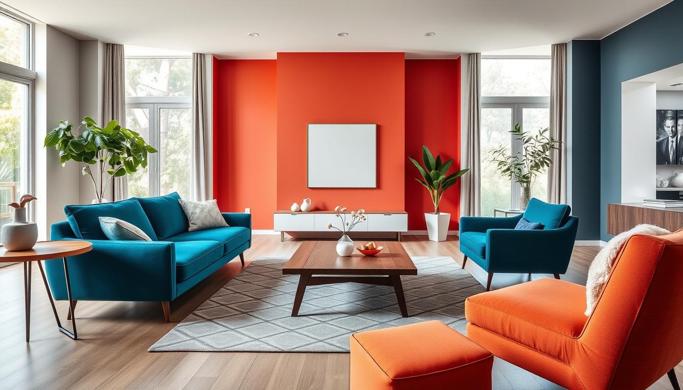
Bold Colors Making a Comeback
Bold colors are now a big part of home design. We’re looking at the best ways to add them to your space. Certain colors are really making a splash in in-demand home decor colors.
“The right color can completely transform a room,” says a leading interior designer. “Bold colors, in particular, can add depth, elegance, and personality to your space.”
Deep Blues: A Touch of Elegance
Deep blues are a trendy house paint color that adds elegance. They work well for creating a calm or dramatic look. Deep blues are both versatile and sophisticated.
To add deep blues to your decor, paint one wall in a rich blue. Or, use blue-toned furniture and accessories. This creates a nice contrast with neutral colors and adds interest.
Rich Greens: Embracing the Outdoors
Rich greens are also back in style. They bring the outdoors in, making your space feel calm and connected to nature. Use green as an accent wall or add plants and foliage.
When using bold colors like deep blues and rich greens, balance them with neutrals. This avoids overwhelming your space. The right balance creates a stylish and harmonious atmosphere that shows off your personal style.
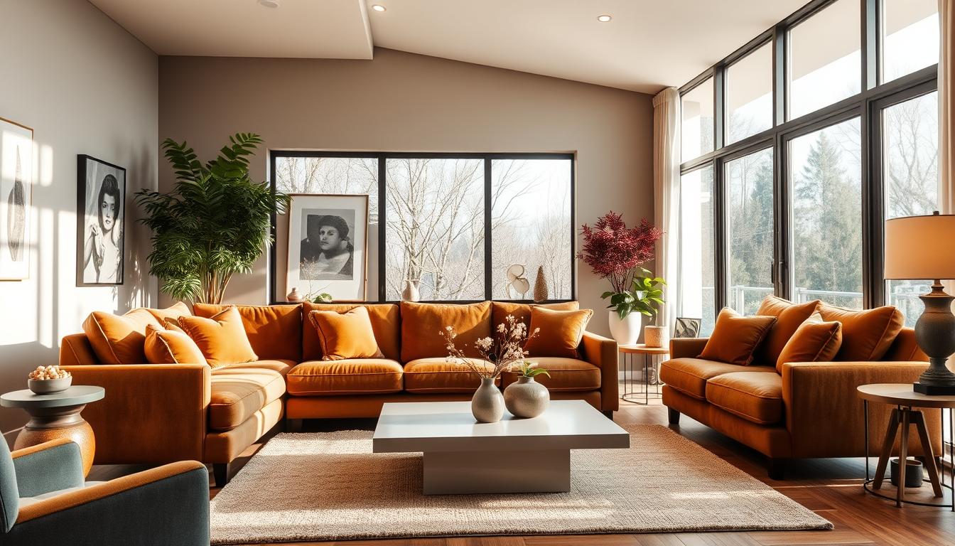
Earthy Tones for a Natural Feel
To make our homes cozy and organic, we’re choosing earthy tones like terracotta and olive green. These colors bring warmth and comfort to our living spaces.

Terracotta: Warmth and Comfort
Terracotta is a warm, inviting color that makes any room feel cozy. It’s great for living rooms and bedrooms where we want to relax.
Here are some ways to use terracotta in your decor:
- Use terracotta-colored pots and planters for a natural look
- Add terracotta-hued throw blankets and pillows for warmth
- Paint a wall terracotta to make a statement
Olive Green: Calming and Grounding
Olive green is another popular earthy tone in home decor. It brings calm and balance to our spaces.
Here’s how to add olive green to your decor:
- Bring in olive green plants or foliage
- Use olive green accents like vases or decorative objects
- Make your furniture upholstery or throw pillows olive green
By using these earthy tones, we can create a natural and calming home. It’s perfect for relaxing and unwinding.
Monochromatic Schemes for Modern Homes
The monochromatic color scheme is a popular choice for modern homes. It offers a clean and minimalist look. By using different shades of one color, you can create a beautiful and harmonious space.
To get a sophisticated look, it’s key to work with various shades of your chosen color. Start with a primary color and then find its different shades and tones. This adds depth and interest to your space.
Exploring Variations of One Color
When looking at different shades of one color, think about the color’s undertones. Also, consider how it looks under different lights. For example, a blue scheme can range from soft pale blues to deep navy blues. Each shade can create a unique mood and atmosphere.
Key considerations include:
- Understanding the color wheel to identify complementary shades
- Experimenting with different textures to add depth
- Using lighting to enhance the color’s appearance
Tips for Balancing Monochromatic Decor
To balance a monochromatic decor, it’s not just about using different shades of one color. It’s about creating a space that looks good and feels right. Here are some tips to help you achieve this:
Mixing textures is a smart way to add depth to your space. Try combining smooth surfaces with rougher textures. This makes your space more interesting.
Another tip is to incorporate natural elements. Add plants or a vase with branches. This brings in organic textures and tones that match your color scheme.
The Rise of Pastel Shades
The world of interior design is seeing a comeback of pastel colors. These colors bring softness and serenity to our homes. As we look at the latest trends, it’s clear that pastel shades are changing how we decorate.
Pastel colors like soft pinks, blues, and mint green create calming spaces. They look good and make rooms feel peaceful.
Soft Pinks and Blues: Light and Airy
Soft pinks and blues are big in home decor right now. They work well with many styles, from modern to traditional. For example, soft pink walls with white trim and furniture look feminine and delicate.
Using soft blue as an accent wall or for furniture upholstery adds a soothing element. It’s great for bedrooms or living areas.
Mint Green: Refreshing and Inviting
Mint green is also becoming popular in home design. It adds elegance to any room. Mint green walls with gold accents create a luxurious and sophisticated feel.
To use mint green without overwhelming a space, pair it with neutral colors. A visit to a home decor website can help you see how to use it well.
| Pastel Shade | Decorating Idea | Room Suitability |
|---|---|---|
| Soft Pink | Pair with white trim and furniture | Bedrooms, Living Rooms |
| Soft Blue | Use as an accent wall or furniture upholstery | Bedrooms, Living Rooms, Bathrooms |
| Mint Green | Pair with gold accents for a luxurious look | Kitchens, Bathrooms, Bedrooms |
Adding pastel shades to your decor makes your home feel light and welcoming. Whether you pick soft pinks, blues, or mint green, they bring elegance to your space.
Accent Walls: A Color-Infused Trend
Accent walls are a great way to add in-demand home decor colors to your home.
Painting one wall in a bold color creates a focal point. It draws the eye and adds interest.
Choosing the Right Wall for Accent Colors
Think about the room’s layout and natural flow when picking a wall.
The wall behind a bed or sofa is often a good choice.
Also, consider how the room’s lighting will affect the color.
Popular Colors for Accent Walls
The color you choose for an accent wall depends on the mood you want and the room’s colors.
Right now, trendy house paint colors like deep blues and rich greens are in.
- Deep blues add elegance and sophistication.
- Rich greens bring calm and a connection to nature.
- Bold yellows and oranges energize and create a lively vibe.
Choosing the right wall and color can really enhance your home’s decor.
Accent walls are great for making a bold statement or adding interest.
Combining Colors: Seasonal Trends
Updating our home’s color scheme with the seasons is a simple yet effective way to keep our decor looking fresh and current. By incorporating the latest interior color trends, we can create a space that feels modern and inviting.
Spring Color Trends: Fresh and Bright
Spring is the perfect time to introduce fresh and bright colors into our homes. Soft pastel shades, such as pale pink and baby blue, are among the most popular home interior colors for spring. These colors can be paired with crisp whites and natural textures to create a light and airy feel.
Some popular ways to incorporate spring colors include:
- Adding pastel-hued throw pillows and blankets
- Painting a single wall in a soft, calming color
- Using natural textiles like woven baskets and jute rugs

Fall Color Trends: Warm and Earthy
As fall arrives, we can transition our color palette to warm and earthy tones. Rich shades of orange, red, and yellow can create a cozy and inviting atmosphere. These colors can be combined with deep browns and taupes to add depth and warmth to our spaces.
| Color | Description | Example Use |
|---|---|---|
| Warm Orange | A vibrant, inviting shade | Accent wall or throw pillows |
| Deep Red | A rich, bold color | Furniture upholstery or rugs |
| Earthy Brown | A natural, grounding tone | Wood furniture or leather accents |
By embracing these seasonal color trends, we can keep our homes looking fresh and updated throughout the year. Whether we’re drawn to the soft pastels of spring or the warm tones of fall, there’s a wealth of inspiration to be found in the world of interior color trends.
Color Pairings We Love
The world of interior design is full of exciting color pairings. These can inspire your next project. The right color combinations can make a space look harmonious and appealing.
Complementary Colors: The Perfect Match
Complementary colors are pairs that are opposite each other on the color wheel. They create a striking contrast that adds interest to a room. For example, blue and orange or red and green can make a bold atmosphere.
To use this trend, pick one color for the main shade and the other for accents. You can use furniture, rugs, or accessories to do this.
Unexpected Combinations for Unique Spaces
While traditional colors are always popular, trying new pairings can make a space unique. Mixing earthy tones with bold jewel tones adds depth. Soft pastels with rich metallic accents bring elegance.
The key is to balance contrasting colors in a way that feels right. It should reflect your personal style.
To start with new color combinations, try the 60-30-10 rule. Use 60% of the room for a dominant color, 30% for a secondary, and 10% for an accent. This helps achieve a balanced look that’s stylish and welcoming.
Conclusion: Selecting the Perfect Colors for Our Homes
Choosing the right colors for our homes can be tough. But with the best interior design colors in mind, we can make our space reflect our style. This makes our home truly special.
It’s important to pick colors that show our personal style. Thinking about what mood we want helps us choose the right colors. This way, our home becomes a unique and special place.
Personal Style and Trends
Keeping up with trends is also key. It helps us update our space and keep it modern. By using the latest colors, our home gets a fresh look.
Creating a Beautiful Space
The secret to perfect colors is finding a balance. We should mix our personal style with current trends. This way, we create a beautiful space that we’ll love for years. It will feature the best interior design colors and popular paint colors.