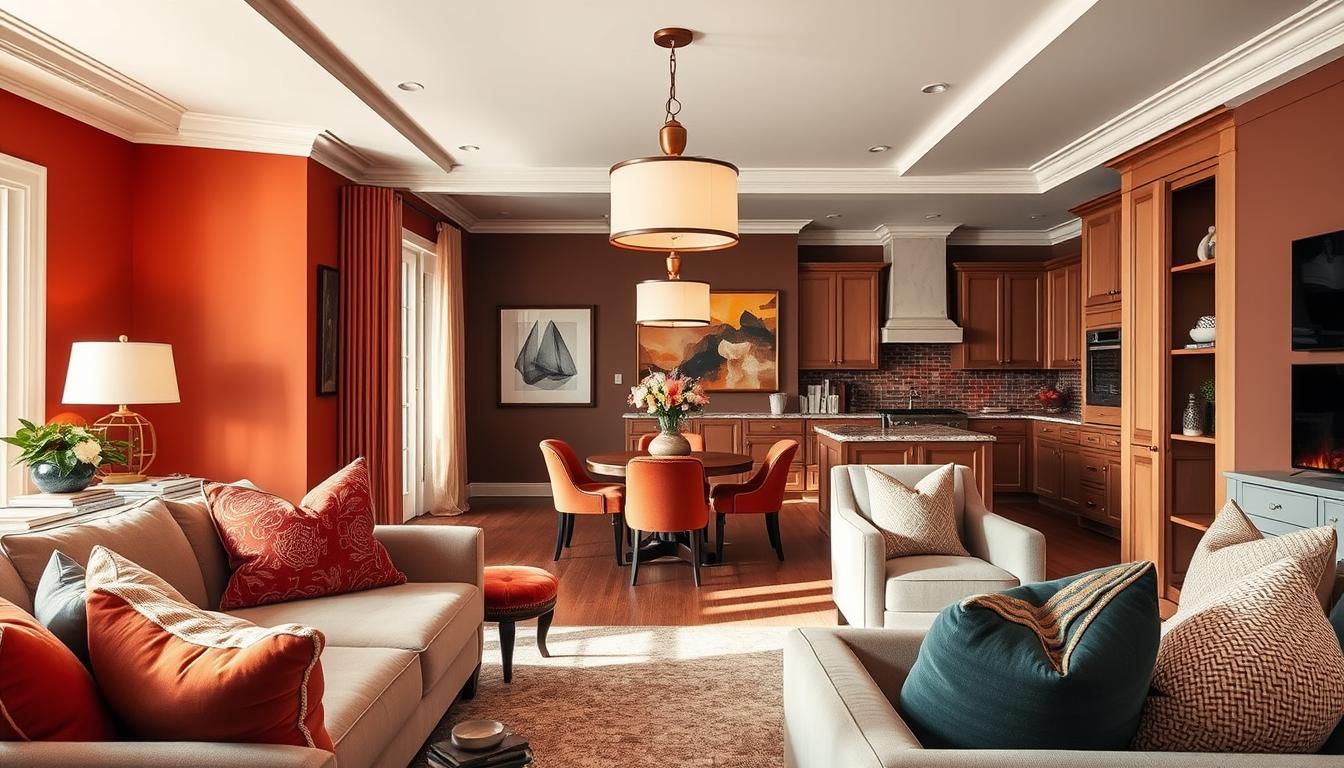
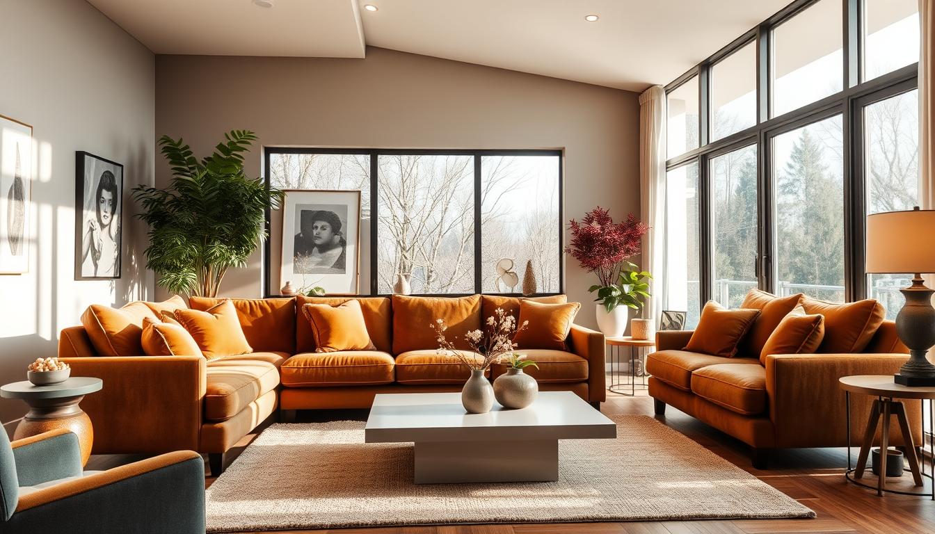
A well-designed color scheme can make your space look better and feel more intentional. Did you know it can even make your home seem more valuable? A single color palette can tie everything together in your living space.
In this article, we’ll talk about why a good color scheme is important. We’ll cover the psychology of colors, the latest trends, and how to pick the perfect palette.
Key Takeaways
- Discover the impact of a unified color scheme on your space’s aesthetic
- Learn how to choose the right color palette for your decor
- Explore popular color trends and their psychological effects
- Understand the importance of considering the psychology of colors
- Get tips on creating a cohesive look throughout your living space
Understanding the Psychology of Colors
Colors play a big role in our home’s design. They can change how we feel, our energy, and our happiness. Choosing the right colors is key to a great home.
The Impact of Color on Mood
Colors deeply affect our emotions and the room’s feel. Warm colors like red, orange, and yellow boost energy. They’re great for places where we chat and laugh, like living rooms and dining rooms.
Cool colors like blue, green, and purple calm us down. They’re perfect for bedrooms and bathrooms, where we want to relax.
“The colors you use will set the mood for how a space will feel,” says Havenly. They start by picking colors that match the room’s mood and purpose.
Choosing Colors for Different Rooms
Each room has its own role, and colors should match that. A home office might need colors that help us focus, like green or blue. A playroom should be bright and fun, with colors that spark creativity.
- Bedrooms should have calming colors for rest.
- Living areas need colors that bring people together.
- Kitchens and dining areas should be warm and inviting.
How to Create a Color Palette
Creating a color palette is more than picking colors you like. It’s about making sure they work well together and fit the room’s needs. Start with a main color, then add one or two colors that match it well.
Use the 60-30-10 rule: 60% of the room should be the main color, 30% a secondary color, and 10% an accent color.
By understanding color psychology, you can make your home stylish and functional. Whether you like the latest trends or classic colors, the right palette can change your space.
Popular Color Trends for 2024
As we enter 2024, home interior design is buzzing with new color trends. These colors promise to change our living spaces. They reflect our personal styles and make our homes welcoming.
This year, we’re moving towards warm colors. Think rich cacao, sunset coral, earthy ochre, and sandy beige. These colors make any space feel inviting and set the mood right.
Earthy Tones: Embracing Nature
Earthy tones are back in 2024. They add warmth and coziness to our homes. Colors like terracotta and sage green can be used in walls and furniture.
Bold Accents: Making a Statement
Bold accents are big in 2024. They add personality to any room. Use them in accent walls, accessories, or furniture to boost your home’s style.
Soft Pastels: Creating Calm Spaces
Soft pastels are still loved for calm spaces. They’re great for bedrooms, nurseries, and bathrooms. Use them on walls, bedding, and accessories for a peaceful look.
| Color Trend | Description | Best Used In |
|---|---|---|
| Earthy Tones | Natural hues that bring warmth and coziness | Living rooms, bedrooms |
| Bold Accents | Statement colors that add personality | Accent walls, decorative accessories |
| Soft Pastels | Gentle hues that create calm spaces | Bedrooms, nurseries, bathrooms |
Using these color trends in your decor can make your home stylish and modern. Whether you like earthy tones, bold accents, or soft pastels, 2024 has something for everyone.
Tips for Choosing the Right Color Scheme
Finding the right color scheme can change your home’s look. We’ll share expert tips to help you choose. Picking the best home interior color schemes means thinking about a few key things. These will affect your home’s feel and look.
Assessing Your Personal Style
Start by thinking about your style. Look at the colors you wear and the art you like. Do you like bold colors or soft ones? Knowing what you like will help you pick colors.
Analyzing Natural Light
Natural light changes how colors look in your home. When picking paint colors for your home, think about the light each room gets. Rooms with lots of sunlight can handle darker colors. Rooms with little light might need lighter colors to stay bright.
Considering Room Functionality
Think about what each room is for when choosing colors. Bedrooms might need calming colors like soft blues. Home offices might do better with colors like yellows or oranges. Pick colors that help each room work well.
| Room Type | Suggested Colors | Effect |
|---|---|---|
| Bedroom | Soft blues, pale greens | Calming, promotes relaxation |
| Home Office | Yellows, oranges | Energizing, boosts productivity |
| Living Room | Neutrals, earth tones | Warm, inviting |
Think about your style, the light in your home, and each room’s purpose. This way, you can pick a home interior color scheme that looks great and works well. Remember, the secret to a good color scheme is balance and harmony. Have fun exploring different colors!
How to Use Neutrals Effectively
Neutrals are key to a versatile home decor. They offer a clean start for adding your personal touch. A neutral color is perfect as the main color of your home. It makes a great base for adding more layers.
Layering Neutrals for Depth
Layering neutrals means using different shades of the same color. This method prevents a room from looking flat. It adds depth and interest.
- Begin with a neutral color on walls and big furniture.
- Add layers with different textures like velvet, linen, or wood.
- Use various shades of your base color in accessories like throw pillows, rugs, and vases.
Combining Neutrals with Accent Colors
Neutrals provide a calm background, but accent colors bring personality. The trick is to mix neutrals with accent colors well.
| Neutral Base | Accent Color | Effect |
|---|---|---|
| Beige or Cream | Deep Blues or Greens | Creates a soothing yet engaging atmosphere |
| Gray | Bright Yellows or Oranges | Adds a modern and energetic touch |
| White or Light Gray | Pastel Hues | Produces a soft, romantic ambiance |
Learning to layer neutrals and mix them with accent colors makes your home stylish and welcoming.
Classic Color Combinations We Love
Home interior design often turns to timeless color combinations. These pairings are loved for their lasting beauty and versatility. Let’s dive into some classic favorites that can make your home stand out.
Blue and White: Timeless Elegance
The blue and white combo is a classic, evoking clear skies and fresh linen. It’s a hit in coastal and traditional designs, bringing calm and serenity. Blue and white can range from bold navy and crisp white to soft baby blue and creamy white. It’s a top choice for designers and homeowners alike.
Gray and Yellow: Modern Cheerfulness
Gray and yellow offer a modern twist. This mix combines gray’s sophistication with yellow’s energy, creating a balanced, cheerful look. Gray and yellow are great for living rooms and kitchens, adding warmth and energy. It’s ideal for those wanting a fresh, lively look.
Green and Beige: Earthy Comfort
Green and beige create a cozy, natural feel. This combo brings the outdoors inside, perfect for bedrooms and living areas. Mixing different greens with beige makes a space inviting and connected to nature. For more on choosing colors, see our guide on color palettes.
| Color Combination | Style | Best Used In |
|---|---|---|
| Blue and White | Coastal, Traditional | Bedrooms, Living Rooms |
| Gray and Yellow | Modern, Contemporary | Living Rooms, Kitchens |
| Green and Beige | Earthy, Natural | Bedrooms, Living Areas |
Accent Colors: Adding Pizzazz to Your Home
Accent colors can make your home more exciting and stylish. They let you add your personal touch to your space. This makes your home feel more dynamic and interesting.
Choosing the Right Accent Color
Finding the right accent color can be tricky. But, the 60-30-10 rule can help. It says 60% of the room should be a main color, 30% a secondary color, and 10% an accent color. This rule helps you make a bold statement without overwhelming the room.
Think about the mood you want in your home. Bold colors like red or orange can energize a room. Soft colors like lavender or pale blue can make it calm.
Where to Use Accent Colors for Maximum Impact
Accent colors can be used in many ways to make a big difference. Here are some ideas:
- Throw pillows and blankets
- Artwork and decorative accessories
- Rugs and mats
- Accent walls or furniture
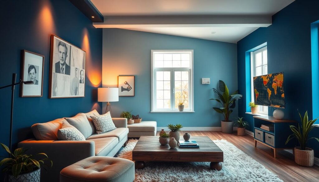
Here’s a table with some popular accent colors and how to use them:
| Accent Color | Potential Use | Effect |
|---|---|---|
| Bold Red | Accent wall, decorative accessories | Energizing, creates a focal point |
| Soft Blue | Throw pillows, bedding | Calming, soothing atmosphere |
| Vibrant Yellow | Rugs, artwork | Uplifting, adds warmth |
By choosing and placing accent colors wisely, you can make your home more stylish and welcoming.
Creating a Cohesive Look Throughout Your Home
Choosing the best color palettes for home decor can really boost your home’s look. A well-chosen color scheme makes your home feel connected and in harmony.
When designing your home, think about how different areas connect. A unified color scheme helps your home feel bigger and more welcoming.
Connecting Spaces with Color
To get a cohesive look, pick a main color for your home. This color will guide your interior design. You’ll also need secondary colors, a trim color, and an accent color for depth and interest.
A whole house color palette usually has six or seven colors. This mix allows for variety while keeping things unified. For example, use different shades of your main color in each room to tie them together.
Using Color Flow in Open Floor Plans
In open floor plans, color flow is key. Since there are no walls, the color scheme must smoothly connect the areas. Use a consistent color palette across all spaces.
For example, in an open-plan living area, use the same main color on walls and vary secondary colors with furniture and decor. This creates a beautiful and cohesive atmosphere.
By planning your home interior color schemes carefully, you can make your home look stunning and unified.
Color Schemes for Small Spaces
In small spaces, color is more than looks; it’s about making rooms feel bigger. The right colors can make our small rooms feel larger and more inviting.
Light Colors to Enhance Space Perception
Light colors on walls and ceilings can make small spaces look bigger. They reflect light, making rooms seem more open. Soft pastels, whites, and creams work well for this. Soft pastels are perfect for a cozy guest bedroom or kids’ room.
Monochromatic Schemes for Minimalism
Monochromatic schemes use different shades of one color. This creates a clean and simple look, great for small spaces. It keeps the room tidy and adds harmony.
Using various blues, from light to dark, can make a room feel calm and big. This style not only makes the space feel larger but also adds elegance.
Choosing the right colors can really change how our homes feel. Whether we pick light colors for a bigger look or monochromatic for simplicity, the right colors can make a big difference.
Seasonal Color Schemes to Refresh Your Home
Seasonal color schemes are a simple way to refresh your home. They keep it looking great all year. By using colors that match the season, your home stays fresh and inviting.
Summer Brights: Breezy Vibes
Summer is the perfect time for light, airy colors. Try soft blues, sunny yellows, and crisp whites. These colors make your home feel spacious and welcoming.
Some popular summer color schemes include:
- Coastal-inspired palettes featuring blues and greens
- Bright and cheerful combinations of yellow and white
- Soft pastel shades for a calming ambiance
Autumn Hues: Warmth and Coziness
Autumn brings warmer, cozier tones. Consider rich oranges, deep reds, and earthy browns. These colors add warmth and comfort to your home.
Here are some ways to add autumn hues to your decor:
- Using warm-toned throw blankets and pillows
- Incorporating natural elements like pinecones and leaves
- Painting a single accent wall in a bold autumn color
Let’s compare summer and autumn color schemes:
| Season | Color Palette | Decor Ideas |
|---|---|---|
| Summer | Soft blues, sunny yellows, crisp whites | Light fabrics, natural textures, coastal decor |
| Autumn | Rich oranges, deep reds, earthy browns | Warm-toned throws, natural elements, bold accent walls |
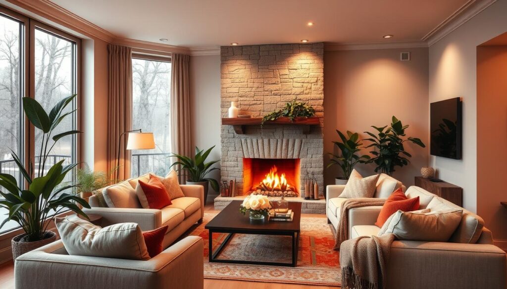
Embracing seasonal color schemes keeps your home fresh and stylish. Whether you love summer’s brightness or autumn’s coziness, there’s a palette for you.
DIY Tips for Exploring Color in Your Interior
Changing your home’s feel starts with picking the right colors. We’re here to help you through this process. When picking paint colors for your home, take your time and be creative.
Always test colors in each room because light changes how they look. This simple step can prevent expensive mistakes later. Here are some DIY tips to explore color in your interior.
Testing Colors with Sample Paints
Before picking a paint color, test it first. Use sample paints to see how the color will look on your walls. This is key because colors can look different on small swatches versus big areas.
- Apply the sample paint to different walls to see how it looks at various times of day and under different lighting conditions.
- Observe how the color interacts with the furniture and decor in the room.
- Take note of how the color makes you feel; this can be just as important as how it looks.
Using Swatches to Visualize Combinations
After choosing colors, use swatches to see how they work together. This is great for home interior color schemes with many colors.
- Gather fabric swatches, paint samples, and other materials that represent the colors you’re considering.
- Arrange these swatches together to see how they complement or contrast with each other.
- Don’t be afraid to experiment with unexpected color combinations; sometimes, the most unique pairings lead to the most striking results.
By following these DIY tips, you can pick interior paint color ideas that look great and improve your home’s feel. Remember, finding the perfect color scheme takes patience and creativity.
Unique Color Schemes for Different Styles
The right color scheme can really make your interior design pop. Each style, like industrial, coastal, and bohemian, has its own color palette. These palettes can take your space to the next level.
Let’s dive into some of these color schemes and how to use them in your home.
Industrial
The industrial style mixes dark and light elements. To get this look, pair exposed brick reds and deep grays with lighter metallic tones.
Key colors:
- Exposed brick red
- Deep grays
- Metallic tones
As Elle Decor points out, “Industrial spaces use raw materials like concrete, steel, and reclaimed wood. The right colors can really enhance them.”
Coastal
Coastal interiors aim to capture the sea’s freshness. Soft blues, sandy beige, and crisp whites are key.
Key colors:
- Soft blues
- Sandy beige
- Crisp whites
“The coastal style brings the outdoors in, with colors that reflect the sea, sand, and sky.” –
Bohemian
Bohemian style is all about vibrant, eclectic mixes. Use layered teals, blues, blacks, and a splash of fuchsia for a bohemian vibe.
Key colors:
- Layered teals and blues
- Deep blacks
- Fuchsia accents
As House Beautiful says, “Bohemian interiors let you show off your personality with color and pattern.”
By using these unique color schemes, you can turn your home into a true reflection of your style. Whether it’s industrial, coastal, or bohemian, the right colors can make it happen.
Resources for Inspiration and Guidance
As we wrap up our look at home interior color schemes, we want to share some great resources. These will help you make your design dreams come true. Whether you need inspiration or guidance, there are many tools and experts ready to help.
Trusted Design Authorities
Websites like Houzz and blogs like The Spruce and Apartment Therapy are full of useful info. They offer expert tips, real examples, and the newest trends to spark your creativity.
Social Media for Trendspotting
Instagram and Pinterest are great for finding the best colors for your home. Follow interior designers and brands like Benjamin Moore. This way, you’ll always know the latest trends and get ideas for your space.
Local Experts for Personalized Guidance
For one-on-one advice, check out local design shops or color consultants. They can pick the perfect colors for your home. You can also visit your Benjamin Moore store or shop online. This lets you see how colors will look before you paint.

