Did you know the right color palette can boost your property value by up to 5%? Picking the perfect home interior color combinations is key to making your space inviting. The colors you choose can really change how your home looks and feels.
Choosing the right color combinations might seem hard, but it can be fun and creative with the right help. In this article, we’ll share our best color combination ideas. They’re here to inspire you to make a stunning and balanced space.
Key Takeaways
- Discover the impact of color on your home’s ambiance
- Learn how to choose the perfect color combinations for your space
- Get inspired by our top color combination ideas
- Understand the importance of a cohesive color palette
- Explore how to create a welcoming atmosphere with color
Understanding Color Theory and Its Impact on Interiors
Effective interior design relies on understanding color theory. It’s not just about choosing colors that look good. It’s about creating a visual language that speaks to those who use the space.
The Importance of Color in Home Design
The Importance of Color in Home Design
Colors are key in home design. They affect how a space looks and feels. The right interior design color schemes can make a room feel bigger, cozier, or more lively.
- Colors can change our mood and energy.
- Different colors can make a room seem bigger or smaller.
- The right color scheme can bring together different design elements.
How Colors Affect Mood and Perception
Colors can make us feel certain ways and change how we see a space. Cool colors like blues and greens can calm us. Warm colors like oranges and reds can energize us. Knowing how colors affect us helps us choose the right interior design color schemes for our homes.
Some important things to think about include:
- The emotional effects of different colors.
- How light can change how we see colors.
- Our personal taste in colors.
By thinking about these things, we can use color to make spaces that are not just pretty. They can also support our well-being.
Classic Color Combinations for Timeless Elegance
Classic color combinations are key to timeless elegance in home decor. They offer a palette that never fades. These schemes have been loved for decades, known for their versatility and elegance.
The Power of Neutrals
Neutral colors like beige, cream, and soft gray are at the heart of many classic schemes. These popular paint color combinations create a calm, serene feel. They’re perfect for living rooms and bedrooms. Plus, they let you add pops of color with furniture and decor.
For instance, a soft gray wall can be paired with a bold piece of furniture or artwork. This creates a stunning contrast that adds interest to the room.
Bold Accents to Enhance Classic Colors
While neutrals offer a timeless base, bold accents can add personality. Think about adding rich jewel tones like emerald green or navy blue. They make a striking contrast with your neutral base.
For more ideas on making your home beautiful with classic colors, check out our article on our top home interior color schemes. It’s full of tips on picking the right colors for your home.
Modern Color Palettes for a Trendy Look
Updating your home is more than new furniture. It’s also about the colors you pick. Modern color schemes can make your home look trendy and stylish.
In modern home decor, color is key. It sets the mood of your space and affects the feel. We’re seeing a move towards soft, calming colors and bold, striking shades.
Utilizing Pastels for a Soft Feel
Pastel colors are back in home decor. These soft hues bring a calming vibe, great for bedrooms or living rooms. Pair pastel walls with neutral furniture for a balanced look. Check out whole-house color schemes with pastels for inspiration.
Popular pastel colors include soft pink, baby blue, and mint green. You can use them alone or mix them for a unique look. For example, soft pink walls with baby blue accents can add elegance to any room.
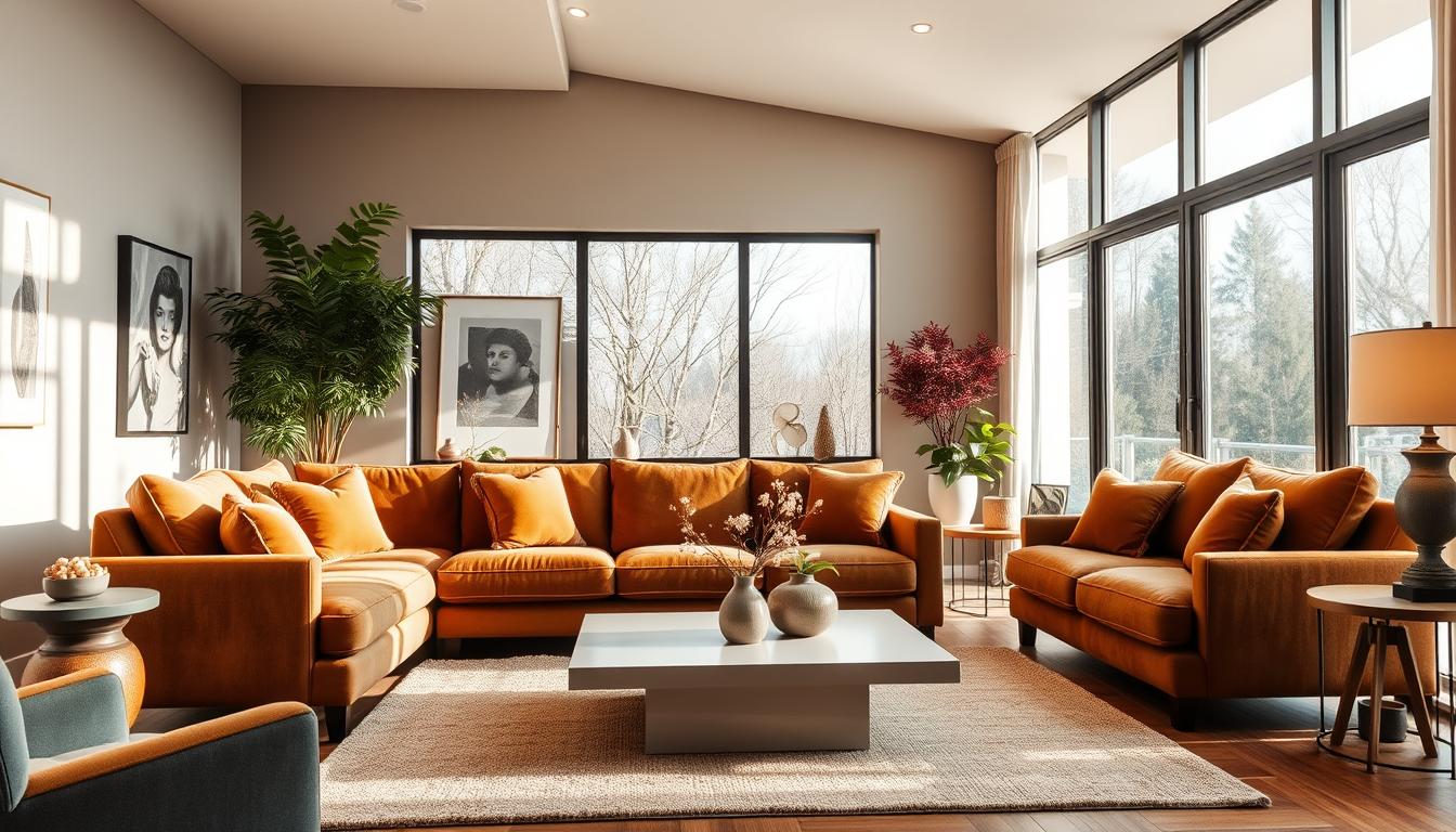
Darker Shades for Dramatic Effects
Darker shades are also trending in home decor. Colors like charcoal grey, navy blue, and deep emerald green add drama and sophistication. They’re great as accent walls or in furniture and decor.
To balance darker shades, add lighter elements. For example, a dark accent wall with light-colored furniture creates a striking contrast. Here’s a simple comparison of light and dark color schemes:
| Color Scheme | Description | Ideal For |
|---|---|---|
| Pastel | Soft, calming colors | Bedrooms, Living Rooms |
| Dark | Dramatic, bold colors | Accent Walls, Furniture |
By using these modern color palettes, you can make your home look trendy and welcoming. Whether you like soft pastels or bold darker shades, there’s a modern trend for you.
Nature-Inspired Color Combinations
Using nature’s colors in our homes is a classic way to make spaces welcoming and peaceful. By taking cues from the outdoors, we can pick a color palette for interiors that shows our style and brings calm. It’s a way to connect our homes to nature.
Earthy Tones: Drawing from Nature
Colors like terracotta, sienna, and moss green warm up any room. They remind us of the earth’s soil and plants, making spaces feel cozy and calm. Pair these earthy tones with neutral shades to keep the look balanced.
For example, terracotta walls look great with cream-colored furniture. Moss green pairs well with natural wood. Using these colors and materials makes our homes feel more natural and welcoming.
Ocean-Inspired Blues and Greens
The ocean’s colors, from deep blues to soft aquas and greens, refresh and calm our homes. These hues bring the sea’s tranquility indoors. To avoid a cold feel, mix these cool colors with warmer neutrals.
Try soft aqua with white and wood for a calming vibe. Or, pair deep blues with sandy neutrals and coral for a lively beach feel. Adding ocean-inspired colors to your color palette for interiors turns your home into a peaceful oasis.
Choosing nature-inspired colors for our homes makes them beautiful and uplifting. Whether you prefer earthy tones or ocean colors, the goal is to find a mix that reflects you and highlights your space’s natural beauty.
Harmonizing Colors Through the Use of Contrast
Learning to use contrast in colors is key for a welcoming home. Contrast in interior design means how colors work together. It makes a room look better and more interesting.
Contrast comes from mixing colors with different brightness, saturation, and hue. This mix creates a color scheme that adds depth and interest. Using complementary colors is a big part of creating contrast.
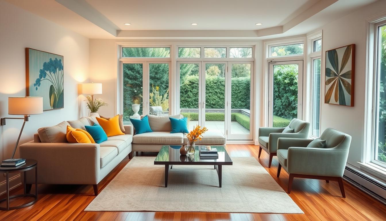
Complementary Colors: The Science Behind It
Complementary colors are pairs that are opposite each other on the color wheel. This makes each color stand out more. Examples include blue and orange, red and green, and yellow and purple. These pairs add energy and excitement to a room.
Our eyes process color in a special way. When we see a color, our eyes adjust to its wavelength. Adding a complementary color makes the colors seem more vivid. This trick can highlight a room’s focal point or add interest to a single color scheme.
Creating Balance with Contrast
Contrast is great for visual interest, but balance is also crucial. Too much contrast can be too much, while too little can be dull. To find the right balance, we can adjust color saturation and brightness.
Using a dominant color with complementary accents is a good way to balance. For example, blue as the main color with orange accents creates a nice contrast. The goal is to find a balance that suits the space and our taste.
| Color Combination | Effect | Best Used In |
|---|---|---|
| Blue and Orange | Creates a bold, energetic contrast | Living rooms, playrooms |
| Red and Green | Adds a festive, dynamic feel | Christmas decorations, festive spaces |
| Yellow and Purple | Produces a bright, luxurious contrast | Bedrooms, luxurious decor |
By mastering color contrast and complementary colors, we can make our homes beautiful and welcoming. It shows off our personal style.
Seasonal Color Trends to Consider
Keeping up with seasonal color trends is key to stylish home decor. As the year changes, so do the colors that are in style. These colors reflect the mood and look of each season.

Warm Hues for Fall and Winter
In fall and winter, warm, rich colors are all the rage. Think terracotta, golden brown, and deep reds. These colors make your home feel cozy and inviting.
Use these colors in throw blankets, pillows, and wall colors. It’s a simple way to make your home warm and welcoming.
Key colors for fall and winter include:
- Deep berry shades
- Rich charcoal grays
- Warm beige tones
Fresh Palettes for Spring and Summer
Spring and summer bring lighter, fresher colors. Soft pastels, vibrant corals, and refreshing greens are popular. Use these colors in decorative items, paint, or outdoor furniture to refresh your home.
Popular spring and summer colors are:
- Soft mint and seafoam greens
- Bright and cheerful yellows
- Cool blues reminiscent of clear skies
By using these seasonal colors, your home will stay fresh and stylish.
Incorporating Textures and Patterns with Color
Mixing textures and patterns with colors can make a room stand out. We often start with colors in interior design. But, adding different textures and patterns really brings a space to life.
Textures make a room feel inviting. For example, smooth surfaces like glass or metal can contrast well with rougher textures like wood or fabric. Try pairing a sleek sofa with a chunky throw blanket.
Mixing Textures for Visual Interest
To mix textures well, use the rule of thirds. Divide your room into thirds both ways. Place different textures at these points. For instance, a plush rug, a leather armchair, and a wooden coffee table can create a nice contrast.
Examples of Textures:
- Soft fabrics like velvet or cotton
- Rough-hewn wood or stone
- Smooth metals or glass
Using various textures adds depth and interest to a room. It makes the space more engaging for everyone.
Patterns That Enhance Color Combinations
Patterns can make our color choices even more interesting. It’s important to think about the colors in the pattern and how they fit with our color scheme.
For example, a geometric pattern with blues and greens can match a room with similar colors. On the other hand, a pattern with contrasting colors can add a lively touch to the room.
| Pattern Type | Description | Example Use |
|---|---|---|
| Geometric | Features shapes like triangles, circles, and hexagons | Accent pillows, rugs |
| Floral | Includes botanical motifs | Wallpaper, bedding |
| Stripes | Horizontal or vertical stripes | Furniture upholstery, curtains |
By carefully adding textures and patterns, we can create a rich and engaging space. This showcases our color choices in the best way.
Personalizing Your Color Choices
Choosing the right colors for your home is about knowing what you like. It’s about matching your taste with the latest in interior design. Your home’s colors show off your unique style.

Different Styles and Their Preferred Palettes
Each interior design style has its own color favorites. For example, modern styles often stick to one color with bold highlights. Rustic styles, on the other hand, love earthy tones.
Knowing these color schemes helps you pick the right ones for your home. This way, your home will look exactly how you want it to.
Here are a few popular styles and their usual colors:
- Modern: Uses a neutral base with bold, vibrant accents.
- Traditional: Includes rich, warm colors like deep reds and golden yellows.
- Coastal: Features calming blues, whites, and sandy neutrals.
The Role of Personal Preference in Color Selection
While knowing style preferences is useful, your own taste matters most. Your home should show off your personality. The colors should make you feel at ease and joyful.
Try out different colors and see how they make you feel. Don’t hesitate to mix things up or get inspiration from nature, art, or your favorite clothes.
By mixing your personal taste with current design trends, you can make a home that’s both stunning and uniquely yours.
Selecting the Right Colors for Different Spaces
Different spaces in your home need different colors. The right colors can change how a room feels and works.
Living Rooms vs. Bedrooms
Living rooms and bedrooms have different roles. Living rooms should have bright colors to spark conversations. Bedrooms need calm colors for better sleep.
Functional Spaces: Kitchens and Home Offices
Kitchens and home offices need special color choices. In kitchens, colors can affect how hungry you feel. In home offices, they can help you stay focused. Pick colors that help each space do its job well.
Choosing the right colors for your home can make it both beautiful and useful. It’s all about creating a space that feels just right for you.