Did you know that the colors in your living space can affect your mood? They also change how your modern home looks. Picking the right stylish interior color palettes can make your space welcoming. It shows off your personal style too.
We’ll help you pick the best colors for your home interior. This will make it more beautiful and peaceful. Our guide will teach you how to create a modern and stylish look.
Key Takeaways
- Understanding the impact of colors on your mood and space
- Exploring different stylish interior color palettes
- Tips for choosing the perfect modern home interior colors
- Creating a harmonious and inviting atmosphere
- Enhancing your home’s aesthetic appeal with the right color choices
Understanding Modern Color Trends
The world of interior design is always changing. One key factor is the color scheme we pick for our homes. It’s important to know what influences our color choices.
The Influence of Minimalism
Minimalism has become a big trend in home design. It shapes how we choose colors. Minimalist spaces use neutral tones for a clean look. These trendy color combinations for interiors bring calm and let us add color with furniture and decor.
Key elements of minimalist color schemes include:
- Soft whites and creams
- Monochromatic neutrals
- Subtle texture variations
Earthy Tones and Their Appeal
Earthy tones are back in style, adding warmth to modern homes. These contemporary home design color schemes take cues from nature. Shades like green, terracotta, and sandy neutrals make spaces feel cozy.
Some favorite earthy tones are:
- Sage green
- Terracotta red
- Sandy beige
Popular Color Palettes in 2023
In 2023, trendy color combinations for interiors mix soothing neutrals with bold colors. The standout palettes are:
| Color Palette | Description |
|---|---|
| Soft Neutrals with Bold Accents | Combining calming neutrals with vibrant accent colors for a balanced look |
| Monochromatic Earth Tones | Using various shades of a single earthy tone to create depth and cohesion |
Knowing these modern color trends helps homeowners choose wisely. They can create stylish spaces that show off their personal style.
The Psychology of Color in Home Design
The colors we pick for our homes greatly affect our mood and health. When designing our spaces, it’s key to think about how colors make us feel. This helps us create a place that looks good and feels good too.
How Colors Affect Our Mood
Colors can make us feel different ways. Warm colors like red, orange, and yellow make us feel energetic and excited. On the other hand, cool colors like blue, green, and purple help us relax and feel calm. Knowing this helps us pick the right colors for our homes.
Let’s look at how some popular colors affect us:
| Color | Emotional Impact | Best Used In |
|---|---|---|
| Blue | Calming, Trusting | Bedrooms, Bathrooms |
| Red | Energizing, Stimulating | Dining Rooms, Living Rooms |
| Green | Balancing, Refreshing | Living Rooms, Home Offices |
Choosing Colors for Different Rooms
Different rooms have different uses, and their colors should match. For example, a bedroom should be calm, so cool, soft colors are best. A home office, on the other hand, might need colors that help you stay focused.
When picking popular house paint colors or chic interior color trends, think about the room’s purpose and the mood you want. For example, soft pastels can make a nursery elegant, while bold colors can stand out in a living room.
By choosing colors wisely, we can make our homes not just look good but also support our well-being.
Popular Modern Color Schemes
Color schemes are key in modern home decor. They set the mood of a space. Modern colors are about looks and creating a space that shows your style.
Homeowners have many color scheme options. Let’s look at some top modern color schemes in home decor.
Monochromatic vs. Complementary Colors
Monochromatic and complementary color schemes are popular. A monochromatic color scheme uses different shades of one color. It makes a room feel bigger and more harmonious.
Complementary colors are pairs that are opposite each other on the color wheel. They create a striking contrast that adds interest to a room.
For example, a monochromatic blue scheme can be calming. But, blue and orange complementary colors can make a living room lively.
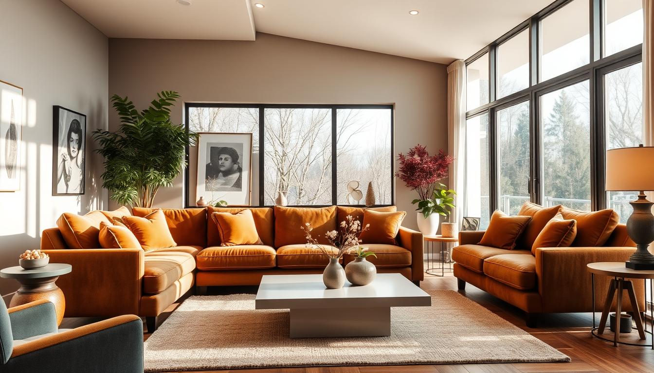
Neutral Base with Bold Accents
Using a neutral base with bold accents is smart. Neutral colors like beige or gray are calm. They let bold colors from furniture or art stand out.
This method makes it easy to change your decor. You can update it with the seasons or new trends.
- Neutral base colors provide a versatile backdrop.
- Bold accents can be introduced through accessories.
- This approach allows for easy updates to the decor.
The Rise of Pastel Shades
Pastel shades are back in home decor. These soft colors bring elegance and calm to a room. They’re great for bedrooms or nurseries.
Pastel pink can make a bedroom romantic. Soft mint green can refresh a bathroom.
Choosing the Right Color for Your Space
Finding the perfect color for your home can be challenging but also exciting. It’s important to think about several key factors that will shape your final choice.
Assessing Room Size and Lighting
The size of your room and its lighting greatly affect color appearance. In smaller rooms, lighter colors can make the space seem bigger. On the other hand, darker colors can make larger rooms feel cozier.
Lighting, whether natural or artificial, also matters a lot. Colors can change under different lighting conditions. So, it’s crucial to test the color at various times and with different light sources.
Harmonizing Color with Furniture and Decor
Your furniture and decor significantly influence your color choice. Choose a color that complements the main hues in your furniture and decor. For example, if you have a lot of wood tones, consider earthy colors that match these tones.
For more information on mastering interior home styles, check out our guide at Lia Interieur’s Guide. This resource can help you make informed decisions about your color choices and overall interior design.
Considering Architectural Features
The architectural features of your home, like moldings, archways, and built-in shelves, also affect your color choice. You can use color to highlight these features or blend them into the background. For instance, painting moldings a contrasting color can make them stand out, adding visual interest to the room.

By considering these factors, you can pick a color that looks great and enhances your home’s overall look. Whether you prefer vibrant home interior hues or more subdued tones, the right color can turn your space into a beautiful and welcoming place.
Creating Flow from Room to Room
To make your home stylish and modern, focus on matching colors in different rooms. A good stylish interior color palette makes your home feel bigger and more connected. It’s all about the flow from one room to another.
When designing your home, think about how colors in each room will work together. Pick a few core colors and change their shades and tones in each space. This creates a smooth flow and continuity.
Strategies for a Cohesive Color Story
One smart way to keep colors consistent is to pick a main color and use its shades in different rooms. For example, use light blue in one room, navy in another, and sky blue in a third. This connects the rooms visually.
- Choose a core palette that shows your style and fits your home’s architecture.
- Use different shades of your core colors in various rooms for a unified look.
- Follow the 60-30-10 rule: 60% main color, 30% secondary, and 10% accent.
Transitioning Colors between Spaces
Changing colors between rooms can be tricky, but there are ways to make it easier. Use a common color in nearby rooms to create a smooth transition. For instance, if you have a bold color in one room, use a hint of it in the next.
| Transition Technique | Description | Example |
|---|---|---|
| Common Color | Use a common color in adjacent rooms. | Using blue in both the living room and the hallway. |
| Gradual Shade Change | Gradually change the shade of a color from one room to another. | Light blue to navy blue. |
| Accent Color | Use an accent color in one room that is a dominant color in another. | Yellow accent in the kitchen, yellow walls in the dining room. |
By using these strategies, you can design a contemporary home design color scheme that looks amazing and flows smoothly from room to room.
Tools and Resources for Color Selection
Finding the perfect colors for your modern home is easier with today’s tools and resources. Choosing the right color palette can be overwhelming with so many options. But, the right tools make this task simpler.
Color Swatches and Sample Boards
Color swatches and sample boards are a classic choice for picking colors. They let you see how colors look in your home’s lighting. By comparing them side by side, you can make better color choices.
These tools also help you see how colors match with your furniture and decor. This hands-on method can help avoid color mistakes.
Virtual Color Visualization Apps
Virtual color apps are a big help in today’s digital world. They let you try out colors on your room’s picture. This way, you can see how colors will look without painting test patches.
Apps from big paint companies are popular. They show you colors and suggest trends. They help you pick the latest chic interior color trends and trendy color combinations for interiors.
| Tool | Description | Benefits |
|---|---|---|
| Color Swatches | Physical samples of paint colors | Realistic color representation, easy comparison |
| Virtual Visualization Apps | Digital apps that superimpose colors on room images | Convenient, reduces need for physical test patches |
| Professional Color Consultation | Expert advice from interior designers or color consultants | Personalized recommendations, expert knowledge of trends |
Professional Color Consultation
Getting expert advice is a great idea. Interior designers and color consultants know the latest trends. They can give you personalized advice based on your needs and style.
With their help, you can pick the right colors for a stunning look. Using color swatches and virtual tools with expert advice leads to a beautiful, trendy interior.
DIY Tips for Painting and Decorating
Painting your home is more than just applying a new coat. It’s about creating an atmosphere that reflects your personal style. With the right techniques and planning, you can get professional-looking results that enhance your color scheme.
Proper Preparation Techniques
Before painting, prepare your walls well. Clean the surface to remove dirt, grime, or grease. Fix any holes or cracks with spackling compound. Proper preparation ensures a smooth finish and helps the paint stick better.
- Clean the walls with a mild detergent and water.
- Fix holes and cracks with spackling compound and sand smooth.
- Tape off trim and edges with painter’s tape.
Best Practices for Applying Paint
Applying paint correctly is key. Use high-quality brushes and rollers for a smooth finish. Start with a primer if you’re using a dark color or covering a light color, as this will help reduce coats needed.
- Apply a primer if necessary.
- Paint in sections, working from top to bottom.
- Use a ‘W’ or ‘M’ pattern with your roller to ensure even coverage.
Finishing Touches to Enhance Color
Once the paint is dry, it’s time for the finishing touches. Remove tape, touch up mistakes, and add decorative elements that complement your color. Consider adding textiles or accessories in coordinating colors to enhance the look.
| Finishing Touch | Description | Benefit |
|---|---|---|
| Remove Tape | Carefully remove painter’s tape to reveal crisp edges. | Professional-looking results. |
| Touch Up | Fix any paint mistakes or areas where paint got on trim. | Ensures a flawless finish. |
| Add Decor | Introduce textiles or accessories in coordinating colors. | Enhances the overall color scheme and ambiance. |
By following these DIY tips and best practices, you can achieve a beautiful, professional-looking finish. Remember, the key to a successful painting project is preparation, patience, and attention to detail.
The Impact of Texture in Color Perception
Texture greatly affects how we see color in our homes. It adds depth and interest to a room, changing how we see colors. Mixing different textures makes a space more lively and interesting.
In interior design, texture is the feel of things like furniture, fabrics, and finishes. Different textures can make colors seem brighter or duller. For example, a matte finish looks different from a glossy one.
Incorporating Textured Elements
To add texture to your home, mix different elements. This can include:
- Furniture: Pick pieces with different textures, like a smooth leather sofa and a chunky woven armchair.
- Fabrics: Use a mix of fabrics like velvet, linen, and cotton to add depth.
- Rugs: Add rugs with different textures for a layered look.
- Wall Finishes: Try textured wall finishes, like Venetian plaster or textured wallpaper, for interest.

Balancing Color with Texture Choices
It’s important to balance color with texture for a harmonious space. Here are some tips:
- Start with a Neutral Base: Use a neutral color palette and add color with textured elements.
- Mix and Match: Combine different textures and colors for a rich look.
- Consider the 60-30-10 Rule: Use 60% of the room for a main color and texture, 30% for a secondary, and 10% for an accent.
By carefully adding texture to your design, you can make your elegant interior color schemes pop. You’ll create vibrant home interior hues that are both beautiful and engaging.
Maintaining Your Modern Color Palette
To keep your home looking modern, it’s key to update your color palette. This means making smart changes to keep your space stylish and welcoming.
Refreshing your color palette is easy with new accessories. Choose items that match the best contemporary paint colors and trendy interior colors. Add throw pillows, rugs, or decor in matching hues to tie everything together.
Refreshing with Accessories
Accessories play a big role in your space’s look. Introducing new items that follow current trends can update your color palette without big changes.
Seasonal Color Adjustments
Changing your color scheme with the seasons keeps your space modern. Use seasonal colors in accessories or decor to keep your home feeling fresh and stylish.