Did you know that the colors in your home’s interior can really affect your mood and health? The right colors can turn your space into a cozy retreat that shows off your style. Finding the perfect interior home colors might seem hard, but our guide will help you get started on making your home beautiful and welcoming.
We’ll show you how to pick the best colors for your home interior design. We’ll cover the newest trends and classic rules. Our guide aims to help you make smart choices and steer clear of common mistakes.
Key Takeaways
- Understand the impact of color on your mood and well-being
- Learn how to choose a palette that reflects your personal style
- Discover the latest trends and timeless principles in home interior design
- Avoid common mistakes when selecting interior home colors
- Create a beautiful and inviting atmosphere in your home
Understanding the Psychology of Colors in Home Design
Colors can change how we feel in our homes. They affect our mood and how we see our surroundings. Knowing the psychology of colors helps us pick the right colors for our decor.
Colors can make us feel different ways. Warm colors like red and yellow make us feel energetic. Cool colors like blue and green calm us down. Choosing the right colors can make our homes beautiful and good for our health.
How Colors Affect Mood
Colors have a big impact on our mood. Different colors can make us feel more awake or relaxed. For example, yellow can make us feel happy and energetic, great for kitchens.
Softer colors like light blue can make us feel calm. They’re perfect for bedrooms. Knowing how colors affect our mood helps us design spaces that feel good.
The Impact of Color on Perception of Space
Colors also change how we see our rooms. Light colors make rooms look bigger. Dark colors make them feel cozy. This is important when picking colors for our homes.
| Color | Perceived Effect on Space | Ideal Room Type |
|---|---|---|
| Light Colors (White, Cream, Pale Gray) | Makes rooms appear larger | Small rooms, corridors |
| Dark Colors (Navy Blue, Dark Green, Rich Brown) | Creates a cozy, intimate atmosphere | Living rooms, bedrooms |
| Neutral Colors (Beige, Soft Gray, Taupe) | Versatile, can make rooms feel balanced | Any room, depending on shade |
Understanding color psychology helps us choose the right colors for our homes. This knowledge lets us create spaces that are not only beautiful but also good for our minds and feelings.
Identifying Your Personal Style
Finding your personal style is key to picking the right colors for your home. Your style shows who you are and makes your space feel like home.
Interior design styles can be grouped into several categories. Knowing these can help you choose the right colors.
Traditional vs. Modern Aesthetics
Traditional styles are all about classic looks, rich colors, and fancy details. If you like traditional, warm, rich colors are perfect. Think deep reds, emerald greens, and golden yellows.
Modern styles, on the other hand, are simple, clean, and minimal. For a modern look, choose a calm color scheme with bold touches. Use whites, blacks, and grays, with bright colors for interest.
Exploring Eclectic and Minimalist Options
Eclectic style mixes different things for a unique look. If you’re eclectic, try bold, contrasting colors with different textures and patterns. The trick is to find something that ties it all together.
Minimalist design is all about simplicity and less is more. Minimalist spaces use few colors, like beige, white, and gray. They focus on clean lines and calmness.
To find your personal style, think about:
- Your lifestyle and how you use your space
- The style of your home
- Your furniture and decor preferences
- The colors that make you happy
Understanding your style helps you choose the best colors for your home. This makes your space reflect your taste and feel welcoming.
Popular Interior Color Trends in the U.S.
Keeping up with the latest interior color trends can really change a home. We’ll look at the most popular paint choices and wall color trends in the U.S. This will help us update our homes with a fresh, modern look.
Earth Tones and Nature-Inspired Palettes
Earth tones and nature-inspired palettes are big in interior design. They add warmth and coziness, making our homes feel more like the outdoors. Colors like sage green, sandy beige, and driftwood gray are popular paint choices for a calming, natural feel.
Bold Hues for Accent Walls
If you want to add drama to your home, bold hues for accent walls are perfect. Deep blues, rich reds, and vibrant yellows can make a room stand out. But, it’s key to balance bold colors with neutral tones to avoid overwhelming the space.
Here are some tips for using bold accent walls:
- Choose a wall that’s seen as soon as you enter the room
- Pick a color that fits with your home’s color scheme
- Balance bold colors with neutral furniture and decor
By following these wall color trends, you can give your home a stylish, welcoming makeover.
The Importance of Lighting in Color Selection
Lighting can change how colors look in your home. It’s key to think about how lighting affects your color choices. Different lighting can make colors look different.
Natural Light vs. Artificial Light
The lighting in your home greatly affects color appearance. Natural light changes with the day, altering color perception. On the other hand, artificial light stays consistent but can vary by bulb type. For example, LED bulbs can change color appearance compared to incandescent bulbs.
To see how colors will look, balance natural and artificial light in each room. For more on lighting and paint colors, check out this article for detailed advice.
Testing Colors Under Different Lighting Conditions
Testing colors in various lighting is essential. Here’s how to do it:
- Paint small swatches of your chosen colors on different walls.
- Observe these swatches at different times of the day.
- Note how the colors change under natural and artificial light.
- Adjust your color selection based on your observations.
This way, you’ll make a better choice. You’ll ensure your colors look great in all lighting.
| Lighting Condition | Effect on Colors | Consideration |
|---|---|---|
| Natural Light | Changes throughout the day | Observe at different times |
| Artificial Light | Varies with bulb type | Test with different bulbs |
| Combined Lighting | Interaction between natural and artificial light | Balance both types for optimal effect |
Choosing Colors for Different Rooms
The colors you pick for your home’s interior can really change how each room feels. Different rooms have different uses, and the right colors can make them work better and look better too.
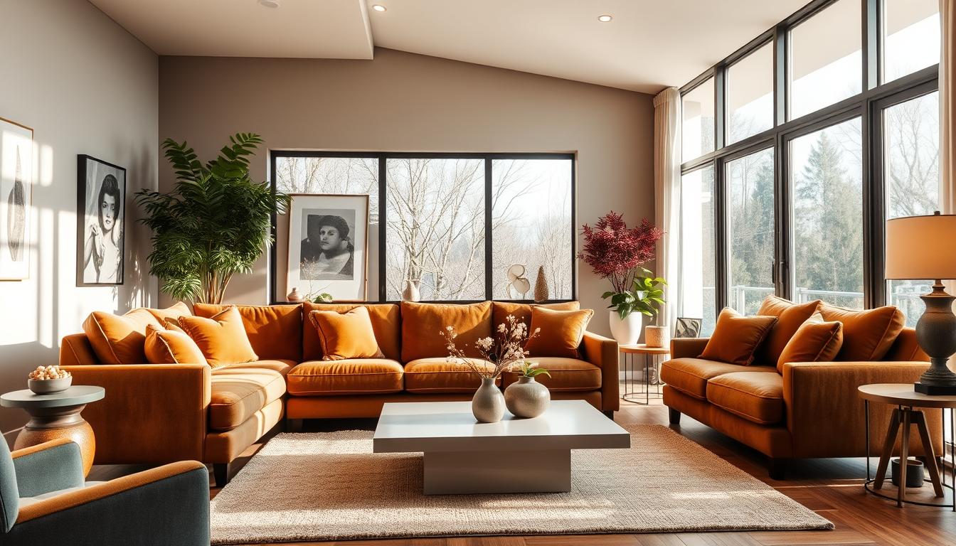
Living Room Color Ideas
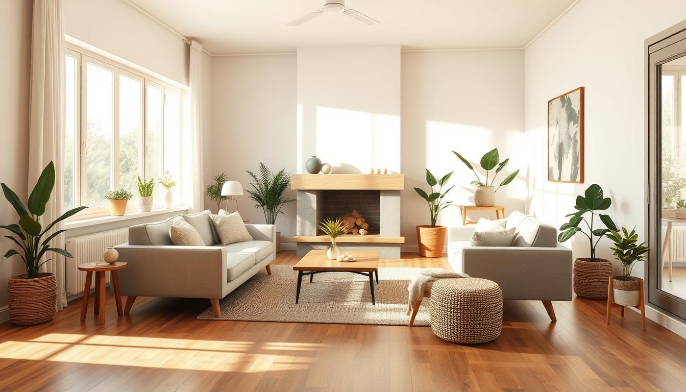
The living room is where families and friends hang out. Choose warm, inviting colors to make it cozy and perfect for talking. Check out living room color ideas to make it feel welcoming. Beige, soft grays, or warm neutrals are great. You can also add a splash of color with furniture or decor.
Kitchen and Dining Room Inspirations
Kitchens and dining rooms should make you hungry and encourage talking. Pick colors that are lively but still welcoming. Whites, creams, and light woods make kitchens feel open and clean. Dining rooms might do well with deeper colors that make you want to stay longer.
| Room | Color Suggestions | Effect |
|---|---|---|
| Living Room | Warm neutrals, soft grays | Promotes relaxation |
| Kitchen | Whites, creams | Feels clean and spacious |
| Dining Room | Rich tones | Encourages lingering |
Bedrooms: Calming Colors for Rest
Bedrooms should be places of peace and rest. Cool, soothing colors like blues, pale greens, or soft lavenders are perfect. They help you relax and get ready for sleep. Think about the natural light in your bedroom and how colors will look at different times.
By picking the right colors for each room, you can make your home feel better and work better. Whether you want a lively spot or a quiet place, the right colors can really change things.
Creating Cohesion Throughout Your Home
To make your home look connected, it’s key to have a color palette. A unified color scheme makes your home design look intentional and in harmony.
Developing a Color Palette
Creating a color palette means picking a few core colors that work well together. Start with a neutral base for big areas like walls and furniture. Then, add one or two accent colors to add personality.
Think about the look you want. For a modern vibe, bold, contrasting colors might be best. For a traditional feel, softer, similar colors are better.

Using Neutrals to Bridge Different Spaces
Neutrals are key for a cohesive look in your home. Use neutral colors on walls, floors, and big furniture to link rooms together.
Here’s how neutrals can work:
| Room | Neutral Base | Accent Color |
|---|---|---|
| Living Room | Soft Gray | Blue |
| Kitchen | White | Yellow |
| Bedroom | Beige | Green |
As the table shows, a neutral base lets you use different accent colors in each room. This way, each space has its own feel while staying cohesive.
By planning your color palette and using neutrals wisely, you can create a beautiful, cohesive home. It will look great and feel welcoming in every room.
Timing Your Color Decisions
Choosing the right colors for our homes is key to their look. It’s important to mix current trends with timeless choices. This balance ensures our homes stay stylish over time.
Seasonal Trends and Color Choices
Seasonal colors change with the year, influencing our choices. Pastels are popular in spring, while earthy tones shine in autumn. Knowing these trends helps us pick the right colors for each season.
To keep up with trends without losing timeless style, use items like throw pillows and blankets. These can be swapped out seasonally, updating your look without repainting.
How to Stay Timeless Amid Trends
While trends inspire us, creating a timeless look needs careful color picking. Choose a classic color palette as your base. Then, add trendy colors with accent pieces.
Understanding color psychology is also crucial. Different colors evoke emotions and moods. For example, blues and greens bring calmness, perfect for bedrooms.
- Select a timeless base color for your walls.
- Add trendy colors through decor and accessories.
- Consider the psychological impact of your color choices.
By balancing current trends with color psychology, we can make homes that are both stylish and lasting.
Using Color to Enhance Architectural Features
Color can make your home’s special features pop. Things like crown molding, trim, and doorways add beauty and elegance. They’re not just for looks; they’re also functional.

Choosing the right color is key to making these features shine. Accent colors help create a visual hierarchy. They draw your eye to certain areas or elements in a room.
Accent Colors for Crown Molding and Trim
Crown molding and trim are classic features that can be highlighted with color. A popular paint choice is a crisp white or soft neutral. This complements the room’s overall look, creating a clean, timeless vibe.
Or, you can pick a bold, contrasting color to make them pop. For example, if your walls are light, a deeper, richer hue on the trim can create a striking contrast.
Painting Techniques for Emphasizing Features
There are painting techniques to highlight architectural features. Using a glaze or wash adds depth and texture. This makes the features you’re highlighting stand out.
For instance, a glazed finish on crown molding looks sophisticated. Techniques like ragging or sponging add a unique texture. This catches the light, emphasizing the feature even more.
By picking the right colors and techniques, you can make your home’s architectural features shine. They become beautiful focal points in your living space.
Tips for Painting and Application Techniques
Choosing the right paint color is just the start. The next step is to apply it correctly for a professional look. With the perfect color picked, it’s time to get your space ready for painting.
Preparing Your Space for Painting
Before painting, make sure to prepare your walls and surrounding areas. Clean the walls to remove dirt and grease. This helps the paint stick better.
Fix any holes or cracks with spackling compound and sand them smooth. Remove outlet covers and switch plates to avoid paint getting stuck. Cover your floors and furniture with drop cloths or plastic sheets to protect them from splatters.
For more info on painting costs, check out this resource. It helps you plan your budget.
Choosing the Right Finish: Matte vs. Gloss
The paint finish greatly affects your home’s look. Matte finishes hide wall imperfections and look flat. Glossy finishes are durable and easy to clean, perfect for busy areas.
Think about the room’s use and traffic when choosing between matte and gloss. Satin or eggshell finishes offer a middle ground. Make sure the finish matches your paint color and home interior design theme.
By using these painting tips, you can achieve a professional finish. Whether you need paint color inspiration or application guidance, the right techniques are key.
Final Touches: Accessorizing with Color
Choosing the best interior home colors is just the start. The final touches can really make or break your home’s look. Accessorizing with color is key to a cohesive, stylish space.
Decorative Elements
Adding color through decor can take your color scheme to the next level. We can make a room feel more welcoming by picking decor that matches our color palette. This includes vases, rugs, and wall art that add a splash of color or support the existing hues.
Textiles and Color Harmony
Textiles are important for color harmony. The right fabrics for upholstery, throw pillows, and blankets can tie a room together. When picking colors for textiles, think about the look you want and the psychology of color.