Did you know that the colors on your walls can really affect your mood and how well you work? The right paint colors can turn your space into a cozy spot that shows off your unique style.
We’re here to help you pick the perfect colors for your space. We’ll look at the newest trends, share tips on picking the best shades, and give you advice on painting. This will help you get the look you want.
Key Takeaways
- Understand the impact of color on your mood and productivity
- Explore the latest trends in paint colors
- Learn tips for choosing the right colors for your space
- Discover practical painting techniques for a professional finish
- Transform your space into a reflection of your personality and style
Understanding Color Theory in Home Design
To make your home welcoming, you need to know about color theory. It’s a set of rules for mixing colors to create a nice look. It helps us see how colors work together.
The Basics of Color Wheel
The color wheel is key in color theory. It shows how colors are connected. It has primary colors (red, blue, yellow), secondary colors (orange, green, purple), and tertiary colors (mixed).
Knowing the color wheel helps pick the best home interior paint colors that go well together.
Warm vs. Cool Colors
Colors are either warm or cool. Warm colors like red, orange, and yellow make us feel energetic. They’re great for lively areas like living rooms and kitchens.
Cool colors, like blue, green, and purple, calm us down. They’re best for bedrooms and bathrooms to help us relax.
The Psychology of Colors
Colors affect our mood and actions in our homes. Blue makes us feel calm and trustworthy. Green connects us to nature and peace.
Knowing this helps pick popular home interior paint colors that make our homes feel just right.
Popular Paint Color Trends for 2023
In 2023, home interior paint colors are changing. We’re seeing a mix of nature and sophistication. The right color can make our homes look better and even improve our mood.
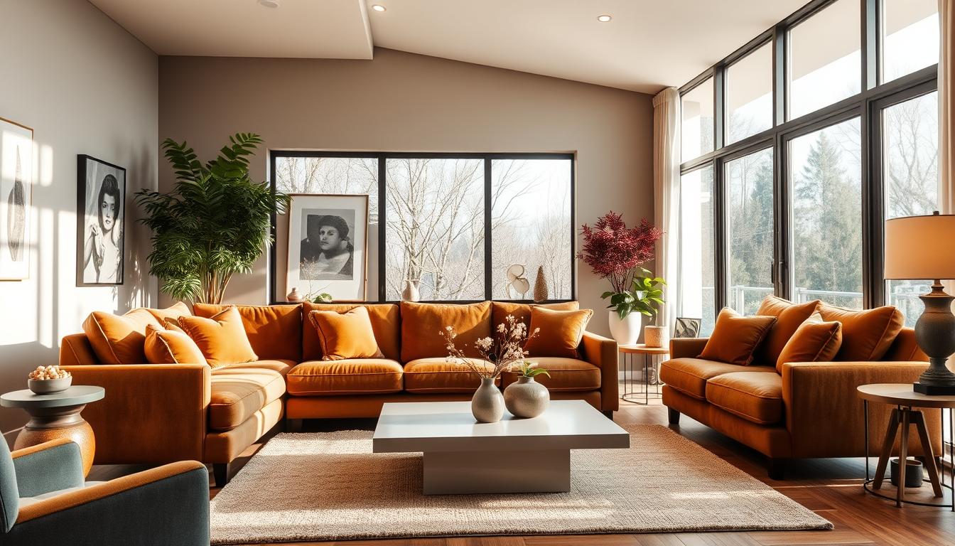
Earthy Tones and Neutrals
Earthy tones and neutrals are big in 2023. They add warmth and calm to our spaces, making them cozy. Beige, taupe, and soft gray are favorites because they match many styles.
Benefits of Earthy Tones:
- Creates a calming environment
- Works well with natural materials like wood and stone
- Provides a neutral backdrop for furniture and decor
Bold Accent Colors
Bold accent colors can make a room stand out. In 2023, deep blues, emerald greens, and rich corals are popular. Use them on an accent wall or in furniture and decor for depth.
“The right accent color can transform a room from bland to grand.” – Interior Design Expert
Pastels and Soft Hues
Pastels and soft hues are also trending. Soft pink, baby blue, and mint green create a calm atmosphere. They’re great for bedrooms and nurseries.
| Color Trend | Description | Best Use |
|---|---|---|
| Earthy Tones | Warm, natural shades like beige and taupe | Living rooms, bedrooms |
| Bold Accent Colors | Deep, rich colors like blues and greens | Accent walls, furniture |
| Pastels and Soft Hues | Soft, calming colors like pink and blue | Bedrooms, nurseries |
These 2023 paint color trends offer something for everyone. Whether you prefer earthy tones, bold colors, or soft hues, the right color can enhance your home’s style.
Choosing the Right Color for Each Room
Different rooms in your home have different uses. The right color can make each space better. When picking affordable home interior paint colors, think about what you want each room to feel like.
Living Room Color Options
The living room is where family and friends hang out. Choose warm colors that make everyone feel at ease. Some great options are:
- Soft neutrals like beige or cream
- Warm grays that add a cozy feel
- Earth tones that bring a natural ambiance
Bedroom Color Selection
Bedrooms are your own special place to rest. Calming colors help make the room peaceful. Think about:
- Soft blues or greens for a soothing effect
- Pale lavenders or lilacs for a relaxing ambiance
- Muted grays or taupes for a calm, neutral background
Kitchen Paint Choices
Kitchens are lively places where meals are made and memories are created. The color can set the mood. Here are some favorites:
- Bright whites or creams for a clean, fresh look
- Warm yellows or oranges to stimulate appetite and conversation
- Cool blues or greens to create a calming yet energizing atmosphere
Bathroom Color Inspirations
Bathrooms are for unwinding and refreshing. The right colors can make this experience better. Consider:
- Soft whites or creams for a clean, spa-like feel
- Calming blues or aquas to evoke a sense of serenity
- Neutral tones like gray or beige for a soothing backdrop
By picking the right colors for each room, you can make your home both beautiful and practical. It will show off your style and meet your needs.
Preparing Your Space for Painting
To get a smooth painting job, you need to prepare your space well. This means doing a few important steps that affect the final look.
Cleaning and Repairing Walls
Cleaning and fixing your walls is a must before painting. Dirt and grease can mess up the paint’s stickiness and look. Use a mild soap and water to clean, then dry it completely.
For holes or cracks, fill them with spackling compound and sand them smooth. Also, check for water damage or mold. Fixing these problems before painting will make your paint last longer. For more tips on wall prep, check out liainterieur.com.
Choosing the Right Finish
The finish you pick can change how your paint looks. You can choose from flat, eggshell, satin, semi-gloss, or high-gloss. Each finish is good for different parts of your home.
- Flat Finish: Perfect for places you don’t walk much, like ceilings.
- Eggshell Finish: Good for living rooms and bedrooms.
- Satin Finish: Ideal for busy areas like hallways and kitchens.
- Semi-Gloss Finish: Best for trim and places that need cleaning often.
- High-Gloss Finish: Great for a bold look and easy cleaning.
Creating a Painting Plan
Having a good painting plan is crucial. First, pick your colors and finish. Then, list what you need, like paint, brushes, and tape.
Get your tools ready. Make sure you have enough paint and plan your painting order to avoid mess. Testing your colors on sample boards is also a smart move.
By following these steps, you’ll get a professional-looking paint job with your top rated home interior paint colors. Remember, good prep is the key to a great paint job.
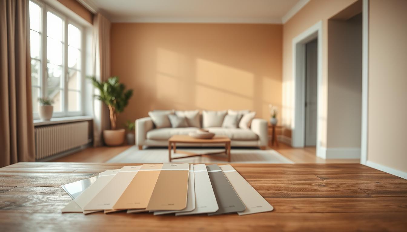
How to Test Paint Colors Effectively
Finding the right paint color can change your home’s look. But, you must test colors well to get it right. This step helps you avoid mistakes and ensures you love the final look.
Sample Boards and Swatches
Using sample boards and swatches is a top way to test paint colors. They let you see how the color looks on your walls under different lights. Make sure the sample boards are big enough to show the color well.
Paint a section of the wall that you can see from different angles and under different lights. This will give you a better idea of how the color will look.
Using Paint Apps
Today, many paint apps can help you test colors online. These apps let you upload a photo of your room and try out different colors on it. While they’re not perfect because screens can vary, they’re a good way to start.
Some popular paint apps come from well-known paint companies. They offer lots of colors and finishes to pick from.
The Importance of Lighting
Lighting greatly affects how paint colors look in your home. Natural light, artificial light, and the direction of your rooms can change the color. For example, a color might look great in a bright room but different in a dim one.
It’s key to see your paint samples at different times and under different lights. This way, you’ll really understand the color.
By using sample boards, paint apps, and thinking about lighting, you can test paint colors well. This helps you pick the perfect shade for your home’s interior.
The Impact of Lighting on Interior Colors
Knowing how lighting affects interior colors is key to picking the right classic home interior paint colors. The right light can change how paint colors look in your home. It can also change the feel and look of your space.

Natural Light Versus Artificial Light
Natural light and artificial light have different effects on paint colors. Natural light makes colors pop, but it changes with the sun’s movement. Artificial light gives a steady color look but can be affected by the bulbs used.
A room with lots of natural light might show off a bright classic home interior paint color during the day. But when the sun goes down, you might need artificial light to keep the mood right.
Choosing the Right Bulbs
Picking the right light bulbs is key for the color you want. Different bulbs give off different colors:
| Bulb Type | Color Temperature | Effect on Paint Colors |
|---|---|---|
| Incandescent | Warm (2700K-3000K) | Enhances warm tones, makes cool tones appear less vibrant |
| LED | Cool (3500K-5000K) | Brightens colors, can make warm tones appear more yellow |
| Halogen | Warm (2900K) | Similar to incandescent, with a slightly whiter light |
Color Appearance at Different Times
Colors can look different at different times of day because of changing light. As an interior design expert says, “The right lighting can make or break a room’s feel. It’s important to think about how colors will look at different times.”
“Lighting is not just about illumination; it’s about creating an atmosphere that complements your home’s interior colors.”
To get a color scheme that works all day, test paint colors at different times and under different lights. This way, you can pick a classic home interior paint color that looks great all day.
Creating a Cohesive Color Scheme
To make your home look great, it’s key to pick colors that work well together. A good color scheme makes your home look better and feel connected. It helps your home look like one big, flowing space.
Understanding Complementary Colors
Complementary colors are pairs that are opposite each other on the color wheel. They add contrast and interest to your home. For example, blue and orange or red and green look amazing together. But, use them wisely to avoid too much color.
When using complementary colors, pick one as the main color and the other as an accent. This mix creates a beautiful and balanced look.
Using Accent Walls
Accent walls are a smart way to add a bold color without taking over the room. Painting one wall differently creates a focal point. It draws the eye and makes the room more interesting.
Think about the room’s colors and what you want to achieve with your accent wall. You can choose a color that contrasts or a similar shade to add depth.
Flow Between Rooms
It’s important to have a smooth transition between rooms. Using the same color palette in your home helps a lot. Pick a few main colors and use different shades in each room. This creates a sense of unity.
| Room | Primary Color | Accent Color |
|---|---|---|
| Living Room | Soft Gray | Warm Beige |
| Bedroom | Light Blue | Crisp White |
| Kitchen | Crisp White | Soft Gray |
By sticking to a color scheme and using complementary colors and accent walls, you can make your home look amazing. It will feel cohesive and welcoming.
Practical Tips for Painting Techniques
To get a professional look when painting your home’s interior, it’s not just about picking the best home interior paint colors. You also need to master the right painting techniques. These techniques help bring out the beauty of your chosen colors.

Rollers vs. Brushes
The tools you use can greatly affect your painting results. Rollers are great for painting large, flat areas fast. On the other hand, brushes work best for trim, edges, and corners. Using the right tool for the job leads to a smooth finish.
For a top-notch finish, mix both rollers and brushes. Start with a roller for the big areas, then use a brush for the edges and trim.
Cutting In and Taping
Cutting in means painting the edges and corners where a roller can’t reach. Use a high-quality brush for this to get a sharp line. Taping is also key for a clean edge between colors or paint and trim.
“The key to a successful paint job is in the preparation and the details, like cutting in and taping.”
When taping, make sure it’s straight and smooth. Press the tape down well to stop paint from seeping under it. Remove it slowly after painting to avoid pulling off the paint.
Avoiding Common Mistakes
One big mistake in painting is not preparing the surface well. Clean and fix your walls before painting for a smooth finish. Another mistake is using the wrong paint. Choose a paint that fits your walls and the finish you want.
- Not preparing the surface
- Using the wrong paint
- Not allowing enough drying time between coats
By avoiding these mistakes and using the right techniques, you can get a professional finish. This will make your best home interior paint colors look even better.
Maintaining Your Home’s Paint
Keeping your home’s paint in good shape is key to its beauty and value. We know upkeep can seem hard, but the right steps can keep your home looking great.
Regular Touch-Ups and Repairs
Touch-ups are crucial for your home’s paint job. Check your walls often for wear, like scratches or fading, in busy spots. Fixing these quickly stops bigger problems.
For small scratches or scuffs, a touch-up with the right paint works. But for bigger damage, a pro might be needed for a smooth fix.
Cleaning Painted Surfaces
Cleaning your painted surfaces is also key. Use a mild detergent and warm water to clean dirt and grime. Stay away from harsh chemicals or rough cleaners that can harm the paint.
For hard stains, a soft-bristled brush can help. Always test a small area first to make sure the cleaner won’t change the paint’s color or finish.
When to Repaint
Knowing when to repaint is as important as keeping the paint looking good. Watch for signs like fading, chipping, or color changes. Decide to repaint based on the paint’s condition and your desired look.
Interior paint usually lasts 5 to 10 years, depending on the paint quality and exposure. If you’re not sure if it’s time to repaint, talk to a painting expert. They can check your paint and guide you on what to do next.
Final Thoughts on Home Interior Paint Colors
Choosing the right home interior paint colors is a personal and creative process. It can greatly impact the ambiance of your living space. When selecting colors, consider color theory, lighting, and the purpose of each room.
To reflect your personal style, don’t be afraid to experiment with different hues and shades. Investing in quality paint products can also make a significant difference in the final result. For inspiration and guidance, you can explore resources like Emily Henderson’s Style, which offers valuable insights into choosing the perfect paint colors for your home.
Personalizing Your Space
Your home should reflect your personality and taste. By choosing paint colors that resonate with you, you can create a space that feels truly yours. Whether you’re drawn to bold and bright colors or soft and calming tones, the key is to select colors that make you happy and comfortable in your home.
Quality Matters
Investing in high-quality paint products can ensure a smooth and durable finish. Look for paints that offer good coverage and are suitable for your specific needs, such as low-VOC options for a healthier indoor environment.
Embracing Change
Your home’s paint colors can evolve over time as your style and preferences change. Don’t be afraid to try new colors and combinations to refresh your space. Keep it feeling modern and inviting with the latest trendy home interior paint colors.