Did you know that the colors in your home can affect your mood and how well you work? Research shows that certain colors can boost energy levels, improve focus, and even influence your appetite. With so many colors to choose from, picking the right ones for your interior design can be tough.
We think the right color schemes can change a space, making it feel more welcoming and personal. In this article, we’ll share our top tips for choosing the perfect colors for your interior spaces. We’ll help you create a harmonious and inviting atmosphere.
Key Takeaways
- Understand the psychological impact of different colors on your mood and productivity.
- Learn how to choose a color scheme that complements your interior design style.
- Discover the importance of considering lighting when selecting colors.
- Explore the role of neutral colors in creating a versatile space.
- Get tips on how to balance bold colors with neutral tones.
Understanding Color Psychology in Interior Design
Colors have a big impact on how we feel in our homes. They can change our mood, behavior, and even our well-being.
In interior design, color psychology is key. It helps decide how we feel in different rooms. By picking the right colors, we can make our living rooms, bedrooms, and kitchens feel just right.
The Impact of Colors on Mood
Colors can make us feel different ways. For example, blue makes us feel calm and peaceful. It’s great for bedrooms. On the other hand, red brings energy and passion. It’s perfect for living rooms.
Here’s how different colors can affect our mood:
| Color | Emotional Response | Suitable Spaces |
|---|---|---|
| Blue | Calmness, Serenity | Bedrooms, Bathrooms |
| Red | Energy, Passion | Living Rooms, Dining Rooms |
| Green | Balance, Harmony | Living Rooms, Bedrooms |
Choosing Colors for Different Spaces
Choosing the right colors for each room is important. Kitchens do well with warm colors like orange and yellow. These colors make us hungry and want to talk.
For more tips on picking the best paint colors, check out our guide on interior paint colors. It offers great advice on choosing colors that fit your space.
By knowing how colors affect us, we can design spaces that look good and feel good. This makes our homes not just beautiful but also uplifting.
Popular Trends in Home Painting Colors
Exploring interior design, the latest home painting colors are key. The colors we pick for our walls greatly affect our space’s feel and look.
2023 Color Trends We Love
This year, bold and vibrant colors are trending. They bring personality to our homes. Some top modern interior paint colors for 2023 are:
- Deep blues and greens for calm vibes
- Rich yellows and oranges for warmth and energy
- Soft pinks and blush tones for a romantic feel
These colors are stunning and flexible. They let homeowners try out various decorating styles.
Timeless Classics That Never Go Out of Style
Some colors stay popular forever. These classic hues are loved for their lasting appeal and versatility. The best colors for interior walls that always stay in style are:
| Color | Description | Best Used In |
|---|---|---|
| Soft Whites | Clean and crisp, perfect for creating a sense of brightness | Bedrooms, Living Rooms |
| Warm Beiges | Cozy and inviting, great for creating a relaxing atmosphere | Family Rooms, Kitchens |
| Light Grays | Balanced and neutral, ideal for modern decor | Bathrooms, Hallways |
Creating Cohesion with a Color Palette
A well-chosen color palette can make your home feel welcoming and stylish. It’s key to think about the look you want and how colors work together. We’ll look at how to pick a color palette and add accent colors for interest.
Tips for Selecting a Color Palette
Choosing a color palette involves several things. You need to think about your space’s natural light, furniture colors, and your taste. Here are some tips to pick a palette that suits you:
- Start with a neutral base: Neutrals like beige, gray, or white are great for mixing with decor.
- Consider the 60-30-10 rule: Use 60% of one color, 30% of another, and 10% for an accent.
- Think about the mood: Colors like blues and greens calm you, while reds and oranges energize.
Using Accent Colors Effectively
Accent colors add depth and interest. To use them well:
- Choose a color that goes with your main palette.
- Use accent colors sparingly to avoid overwhelming the space.
- Think about the color’s psychological impact and how it makes you feel.
| Color Palette | Description | Best For |
|---|---|---|
| Monochromatic | Using different shades of the same color | Creating a cohesive, sophisticated look |
| Complementary | Pairing colors opposite each other on the color wheel | Adding contrast and visual interest |
| Analogous | Using colors next to each other on the color wheel | Creating a harmonious, natural look |
By following these tips and thinking about color palettes, you can make a beautiful, cohesive interior. It will show off your personal style.
Painting Techniques for Interior Surfaces
To get a professional look, knowing different painting techniques is key. How you paint can change how your interior looks and lasts. Whether it’s one room or your whole house, learning the right methods is important.
Exploring Different Finishes
The finish of your paint job can really change a room’s feel. Each finish has its own benefits, like how long it lasts or how it looks. Here are some common finishes to think about:
- Flat (Matte) Finish: Great for places that don’t get a lot of use, like ceilings, because it covers up blemishes well.
- Eggshell Finish: Has a bit of shine, making it stronger than flat finishes and good for living rooms.
- Satin Finish: Gives a soft shine and is very strong, perfect for busy areas and kitchens.
- Gloss Finish: Very shiny and tough, often used for trim and doors.
Choosing the Right Paint Types
Picking the right paint is as important as choosing the color. Different paints are made for different needs, like being moisture-resistant or easy to clean. Here are some options:
- Latex Paint: Water-based, easy to clean up, and dries fast. Great for most interior jobs.
- Oil-Based Paint: Gives a hard, lasting finish but takes longer to dry and has strong smells.
- Low-VOC Paint: Eco-friendly, releases fewer harmful chemicals.
By knowing about painting techniques, finishes, and paint types, you can choose stylish home interior paint colors and interior color combinations that make your home look better.
Transforming Small Spaces with Color
Color is very powerful in changing small interior spaces. It can change how we see the size and feel of a room. We will look at how to use color wisely in small areas.
Light Colors to Make Rooms Feel Bigger
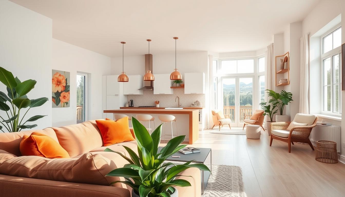
Light colors on walls and ceilings can make small rooms seem bigger. Light colors reflect light, making the space feel open and airy. White, cream, and pale gray are great for small rooms because they make them feel larger.
Using a single light color can also make a room feel bigger. A consistent color scheme helps the room flow better and avoids clutter that makes it feel smaller.
Dark Colors for Intimacy and Warmth
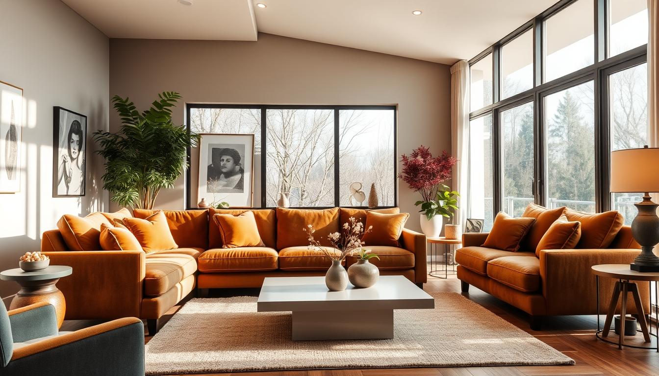
Dark colors can make a room feel cozy and intimate. Colors like navy blue, emerald green, and charcoal gray add warmth and depth. They’re perfect for places like bedrooms or home theaters where you want to relax.
But, using dark colors needs balance to avoid feeling trapped. Try dark colors on one wall or through furniture and decor. This adds depth without overwhelming the space.
Using Neutrals to Your Advantage
Neutral colors in interior design offer a clean start for personal touches. They’re not just plain backgrounds; they’re the base of a room’s character. Knowing how to mix neutrals with bold colors helps create spaces that look good and feel right.
Advantages of Neutral Colors
Neutral colors bring calm and peace to a room, making it welcoming. They also let furniture and decor stand out, making it easy to change a room’s look without big changes.
- Neutral colors have timeless appeal, so you don’t need to paint often.
- They let you choose furniture and decor freely.
- Neutrals can make a room look bigger by reflecting light.
As interior design color schemes change, neutrals stay the same, offering a flexible base for any style. Design experts say, “Neutral backgrounds are key for a balanced and harmonious space.” A well-designed neutral space can be both soothing and sophisticated.

Combining Neutrals with Bold Hues
Neutrals provide a calm base, while bold colors add energy and personality. The trick is to find a good mix. Using bold colors as accents can create a lively contrast that catches the eye.
- Begin with a neutral base on walls and big furniture.
- Add bold colors with smaller items like throw pillows, rugs, and art.
- Try different shades and tones to find the right mix for your space.
Trending paint colors often include bold, bright shades. Mixing these with neutral backgrounds can make a bold statement. For example, a neutral beige with a bold blue can look modern and elegant.
“The right mix of neutral and bold colors can make a room feel new and exciting.”
Learning to use neutrals well and mix them with bold colors lets you create a unique and engaging space. This space will show off your personal style.
Color Combinations to Inspire You
Choosing the right colors is crucial in interior design. It can make any room look better. We often think about which colors will go well together to create a beautiful space.
Exploring different color schemes is a good idea. You can choose between complementary colors or monochromatic looks. Both can add a special touch to your home.
Complementary Color Schemes
Complementary colors are pairs that are opposite each other on the color wheel. They create a striking contrast that energizes a room. For example, blue and orange or red and green make a bold statement. This contrast can be used effectively in accent pieces or furniture to create a focal point in the room.
Designer Kelly Wearstler once said,
“Color is a very powerful tool, and it’s not just about making things look pretty; it’s about creating an atmosphere.”
Monochromatic Looks for a Modern Appeal
A monochromatic color scheme uses different shades of the same color. This creates a cohesive and stylish look. By changing the saturation and brightness of one color, we can add depth and interest.
For example, a monochromatic blue scheme can go from pale sky blue to deep navy. This creates a soothing and harmonious space. This consistency can make a room feel more spacious and serene.
To achieve a monochromatic look, use various textures and materials in the same color family. This adds visual interest and prevents the space from feeling flat or monotonous.
The Importance of Lighting in Color Selection
Lighting greatly affects how colors look, making it key for creative wall painting ideas. When picking modern interior paint colors, think about how light changes the look.
Natural light is a big factor in color perception. During the day, its intensity and direction change how colors look on walls.
How Natural Light Affects Color Perception
A room with lots of natural light makes colors seem more vibrant. But, the light’s direction matters too. For example, a room facing south gets warm light, which brightens warm colors like oranges and reds.
On the other hand, a north-facing room gets softer, cooler light. This is better for cool colors like blues and greens. Knowing this helps pick the right modern interior paint colors for all day.

Utilizing Artificial Light to Enhance Colors
When natural light fades, artificial light takes over. Its effect on color is just as big. Different bulbs (incandescent, LED, fluorescent) light up colors in different ways.
For example, warm white LEDs brighten warm tones, making a room cozy. Cool white LEDs make cool tones look sharp. Trying out different lights can help you find the best look for your creative wall painting ideas.
Thinking about both natural and artificial light ensures your colors look great all the time. This boosts your interior space’s look.
Making a Splash with Accent Walls
An accent wall can add elegance and sophistication to your home. It’s a bold way to introduce a new interior color combination. This can completely change the feel of a room.
Choosing the right wall for an accent is key. This choice greatly affects your room’s look.
Choosing the Right Wall for an Accent
When picking an accent wall, think about the room’s layout and lighting. Also, consider where your furniture is placed. Walls behind fireplaces or staircases are often great choices.
- Look for a wall that naturally catches your eye.
- Think about how the wall’s color will work with the rest of the room.
- Make sure the accent wall doesn’t fight with other design elements.
For more ideas on creating a harmonious interior, check out our guide on our top home interior color schemes.
Trends in Accent Wall Colors
Accent wall colors can really change a room’s vibe. Right now, stylish home interior paint colors like deep blues and greens are popular. They add depth and character.
| Color | Effect | Best Used In |
|---|---|---|
| Deep Blues | Adds depth and calmness | Bedrooms, Living Rooms |
| Rich Greens | Bring in a natural feel | Studies, Dining Rooms |
| Bold Reds | Creates energy and warmth | Living Rooms, Kitchens |
As the table shows, different colors can do different things. This makes it easier to pick the right color for your accent wall.
By choosing the right wall and color for your accent wall, you can make your home look better. It will be more visually appealing and stylish.
Final Thoughts on Choosing Interior Colors
Choosing the right colors for your home’s interior can be tough. With many options, it’s key to know what you like. This way, your home will show off your unique style.
Assessing Personal Style
Think about the mood you want in each room. Consider the light, furniture, and decor. This helps pick colors that make your home look great.
Recommendations for a Successful Paint Job
For a great paint job, use high-quality paint and prep your walls well. Decide on the finish you want, like matte or glossy. Follow these tips and stick to your style for a beautiful home.